They produce a lot of concept art in entertainment media, specifically movies and games. I have a lot of “The Art of…” books in both arenas; they’ve been very inspirational from an aspirational standpoint, giving me some benchmarks to work towards as an illustrator. Another thing that the art might do is open up new avenues for the script to follow, though I haven’t seen this specifically mentioned in any of my books.
It certainly has for me with “Atlantic”.
In writing the script, I have to picture the entire story in my head, as any writer does. But an inherent weakness in this is that when picturing a scene, a writer will tend to picture it generally, and the fog of imagination will often just smooth over the gaps. Unless it specifically affects the story, quite often a scene or location will be just detailed enough to tell its part of the story, but not detailed enough to get bogged down. In screenwriting, where brevity is key, this is especially important, as you don’t have a lot of words to spare.
What’s happened in my case, since I’m an as-yet unproduced writer, I tend to work in a vacuum. I have people I bounce ideas off of, but I don’t really have a solid push-back that a director, say, would provide. Or a producer. Or anyone else who has the power to look at something and say “This has more potential, develop it”. Interestingly enough though, in acting as an illustrator for the story, I’ve begun approaching the story from a different angle, acting as my own “push-backer”. While not as truly objective as someone else, being able to see the story unfold in three dimensions has given me a long checklist of ideas to explore, even with the limited number of art pieces I’ve created so far.
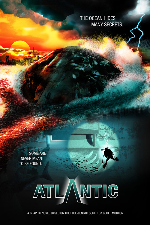
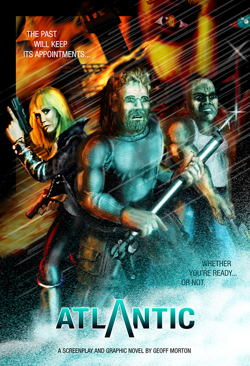
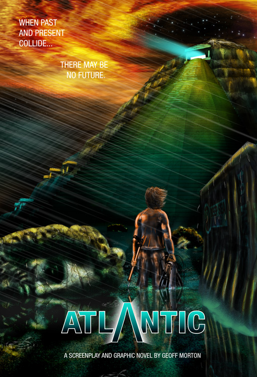
THE POSTERS
The “environmental” poster (#1) was where the visual palette started coming together. The classically overused teal and orange scheme which actually makes sense here, given the contrast of fire and water that makes up the story. I’d started going with teal for the water in an earlier piece, but it was here that the colour pair started showing up.
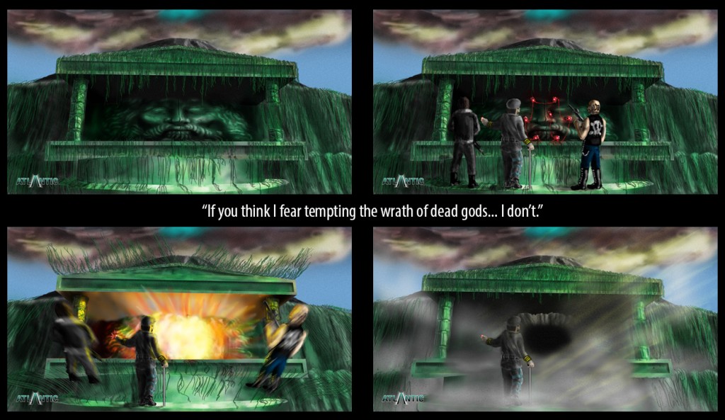
The “character” poster (#2) forced me to really nail down what the main characters looked like. I’d done some sketches of the main three before that, but this is the image I keep referring to when I have to draw them again.
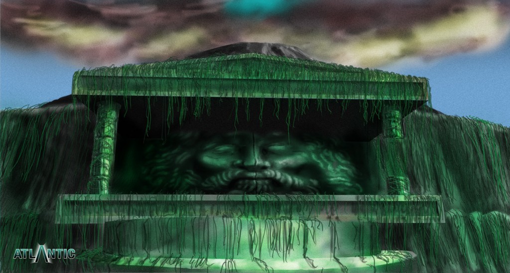
The “Temple Hill” poster (#3) pushed me to think a little more about the island itself. And that “Zeus” head, which I simply originally threw in there as a visual balancing element, began to inspire new (and old) ideas in the story – however, as they’re pertinent to some plot twists, I’m not actually going to talk much more about that.
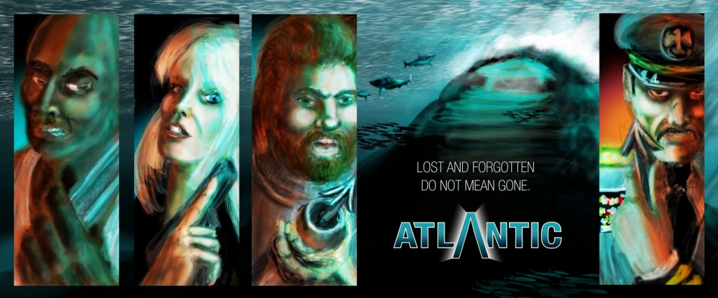
The “banner” (2nd row) didn’t so much inspire new ideas as force me to further play with the appearances of the characters and redraw them in a consistent manner as the “character poster”. Originally inspired by the slipcase poster from “The Art of Marvel Studios”, I wanted to play with that visual feel. I don’t really consider the banner “done”; I do plan to come back to it and make the details a little finer.
THE CONCEPT ART
“Tempting the Wrath of Dead Gods”… now this is what I’m talking about… the concept art really making a difference. That line is not currently in the script. And the script doesn’t have the “Zeus” head on the doors. There were a pair of heads on the doors in the original script, but I decided not to create any kind of “pantheon” of gods for the island. But when I did the third poster, and randomly added the massive Zeus head half submerged in the water, it started to spark a few ideas. And they carried over into this piece.
In the script, Ramirez blasts his way in through the doors without a lot of fanfare. When I added the head to the doors, it changed the nature of that act. What was originally just destruction now felt a little more like desecration. I realized that Cassandra would actually try to talk Ramirez down at that point, to not blast his way in. She would see it as an artifact, as history. Ramirez completely misinterprets her argument and replies “If you think I fear tempting the wrath of dead gods… I don’t.”. Hearing his voice in my head when I looked at the image was actually a bit of an eye-opener for me. It gave me ideas for the pantheon of the island, and the “why” behind it. And it changed the nature of Ramirez blasting his way in. Rather than it just being destruction, it started to feel karmic, like Ramirez was tempting fate with his violations and even I started to wonder “Maybe those dead gods do want him to come inside…”
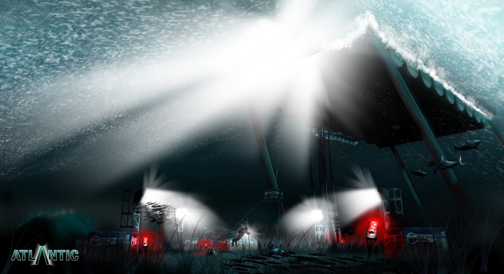
“Worksite” – Inspired by some cool underseas concept art from my “Art of the Mass Effect Universe” book, I thought I’d play around with some undersea art, myself. I’d already built the “Lilypad” in Sketchup, so I constructed the ocean floor, the anchor cables, placed the Island in the distance and found the angle that was flitting around in my imagination. That let me visualize exactly how far down 120-150 feet was, and then I went about making it feel like it was underwater.
Problem was, in the script, I could get away with being incredibly vague about what exactly Fish was doing down at the worksite. I could describe some crates and a silt-blower and leave it at that. But when time came to actually visually play with what he was doing, I realized that like actually filmmakers who’d have to construct the worksite for real and make it credible, even for only a 30 second scene, I’d have to decide what exactly Fish and crew were doing down there.
I didn’t actually take it that far with this shot, I went for more evocative than specific, but it got me thinking, and it got me thinking about the nature of the site itself. And I came to the conclusion that Fish and company are not the actual deep sea miners… they’re the site preparers. The come in, do some blasting, lay down some concrete to get the site ready for the actual mining vessel (and that in itself was inspired by some real-world work I’ve been doing for a shotcrete company). Suddenly, due to this concept art of the underwater worksite, the nature of the job the characters were doing suddenly came into focus.
PLUS – the sharks. I’d described the sharks as being unusually aggressive, in the script. When I tossed some sharks into the scene, circling round some anchor cables in the distance, whole scenerios regarding the shark population suddenly erupted in my head. And I realized that some other scenes I’d written in the script couldn’t go down as written, but could be tweaked to accommodate the new realization. And this was actually much more exciting than it had been before.
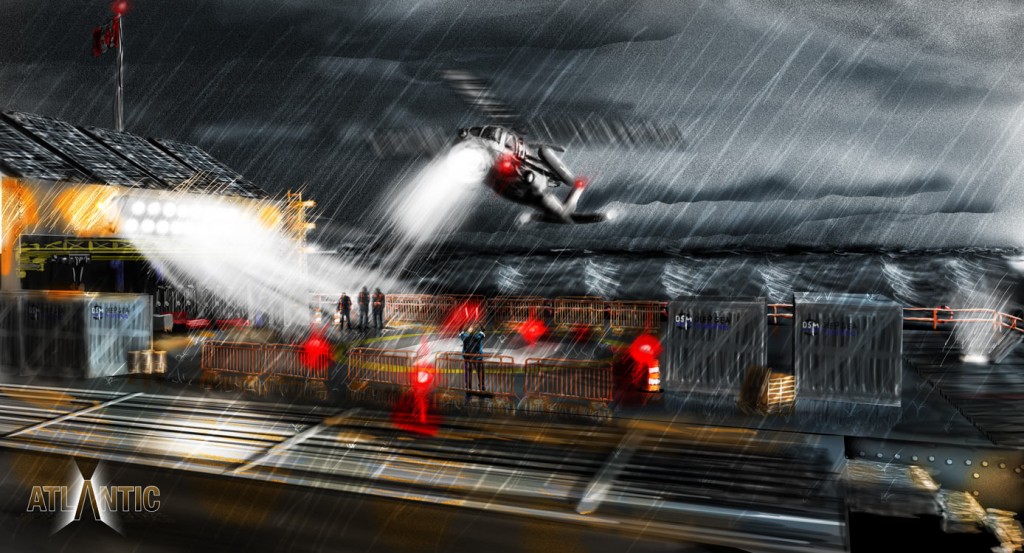
“Landing Pad” – inspired by another videogame art book, this time Halo – The Art of Building Worlds. In that shot, a “Pelican” airship was taking off from a base’s landing pad in the rain. It was a feel I wanted to capture, but in my universe, so again, using my 3D model in Sketchup, laid out the base area and angle, and built up the details from there.
Seeing the scene laid out in front of me gave me a sense of scale to the landing pad and the top of the Lilypad. That little burst of light on the right hand side figures into the script… it’s a hatch Willy opens early in the story that Fish has to use to enter the Lilypad again, later. Problem is, when I wrote the script, it was easy enough to say “on the landing deck”. It wasn’t until I actually built the set and started to ponder where exactly that hatch was located that I realized that certain assumptions I made, that could only be made by a writer handwaving his way through the script, had to be adjusted. Next time I draw maps and actually illustrate my way through the story.
But, beyond those little quibbles, it did much to open up the environment and the scale, and it was the first time I’d drawn Willy. It was a good clue for me as to how he’d dressed.
More to come…
