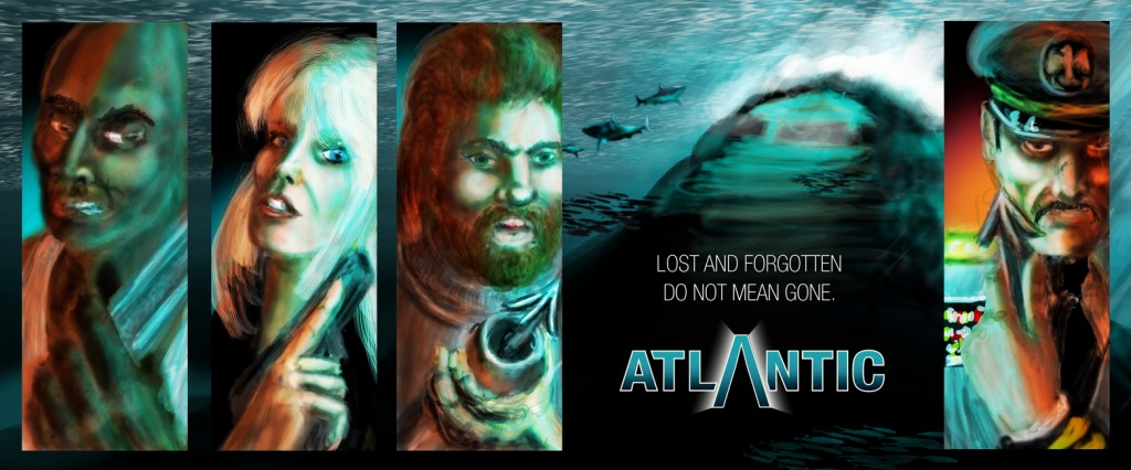
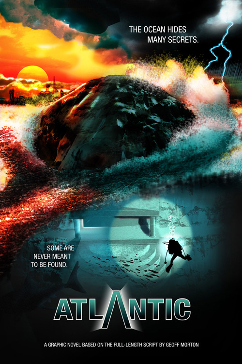
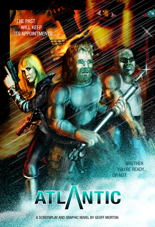
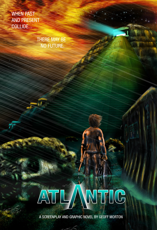
In just about any medium where some product or project needs promoting, the poster is one of the prime ways of doing it. Movie posters range from the “floating heads” Photoshop Frankensteins to (the sadly retired) Drew Struzan’s classic artwork. It was quite a challenge for me to design these posters for “Atlantic”. There are a lot of different aspects of the story to choose from… how to best encapsulate the story, to entice people to want to check it out, without giving it all away?
There were some choices to make. One reason movies do the “floating heads” is because they’re trading on the knowledge an audience already has of either the characters in the story or the appeal of the actors playing them. With “Atlantic” being an unknown quantity, I had to get across information on the characters through body language, pose, expression and props, like Fish’s speargun, Willy’s wrench and Cassandra’s pistols. Alternately, the environmental poster had to hint at the story visually, through locations and mood, rather than action.
Plus there’s the added challenge of designing each one so that they stand alone, but also complement each other as a larger set.
I also have a series of concept art pieces available for view.


