In 2002 I joined Big Brothers of Sudbury as a volunteer and “Big Brother”. Initially I was simply an event volunteer, but over time I began to donate my services as a design professional to the agency. It’s a service I still provide quite happily to the agency to this day.
Tim Hortons Big Brothers Big Sisters Bowl For Kids Sake
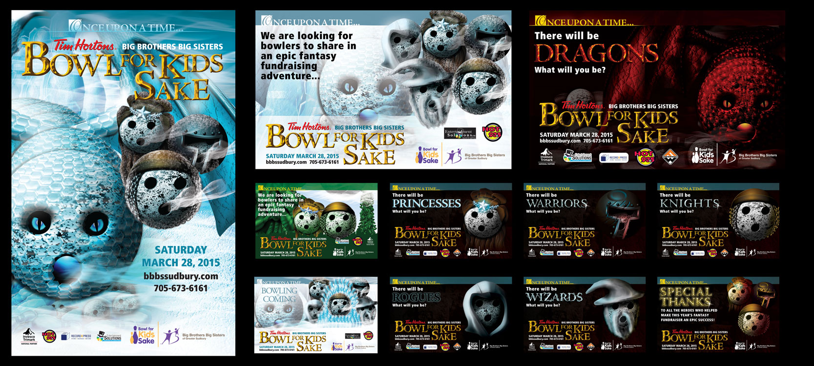
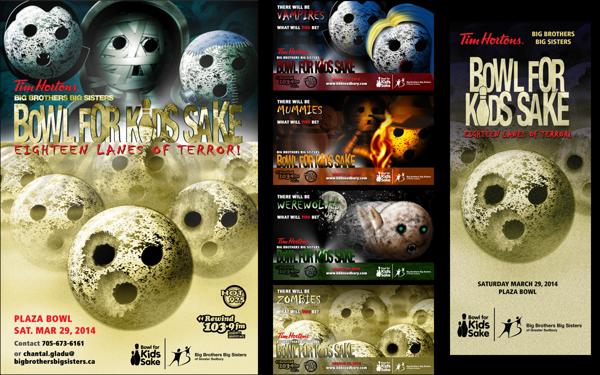


Every year I help the local Big Brothers Big Sisters agency prepare their materials for the annual Bowl For Kids Sake tournament. In recent years, since they brought on Tim Hortons as a major sponsor for the fundraiser, we’ve been using standard national agency and Tim Hortons promotional material; however, when the agency’s contact with the Sudbury franchises saw my “skull and crossbones” poster, BBBS got the go-ahead to replace the generic material with mine for all the pieces; of course, this created a lot of work for me, applying my design to all the other pieces, but it was worth it and it will be displayed in all of the local 21 Tim Hortons stores.
For a step-by-step on the development of the “skull and crossbones” design, click here.
Big Brothers Big Sisters Bowl For Kids Sake Themes
The “Pirate” theme created for the Greater Sudbury agency proved to be a big hit, and they received a call from another agency asking if they could use the theme for themselves. This made me realize that there was a market with other agencies for custom artwork, and that I could potentially sell packages to them. I also realized that the odds of someone wanting to buy a theme would increase if I had more than just the pirate theme available.


")


So… I put in a ton of work “on spec” (and let’s be honest, they were fun and let me flex some illustrating muscles and explore some visual ideas). I know the Sudbury agency is having a hard time deciding which one to go with next year, but they’ll have choices, and I’ve had a blast exploring all these different character styles.
Ongoing Campaign
In my early years designing for the agency, I used my real-life match for the advertising, and over the course of three or four years he became the unofficial “face” of the organization. I think the ongoing progression of ads, where people could see him “growing up”, provided a real emotional connection and underscored the value of Big Brothers Big Sisters in the community.


General Layout
Some of the work I do these days hews close to the national brand standards (left) using stock photos supplied by their website, but some of the materials are also still homegrown (right). I still respect the brand identity, such as colours and font usage, but the visuals are all created by myself and reflect the personality of the local agency.


Illustration
Once my “little brother” outgrew modelling for the advertising, I turned to my Illustrator/Photoshop skills to give Big Brothers Big Sisters their promotional material.


