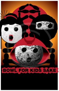
I’ve recently engaged on a little project to create themes for the Bowl For Kids Sake that are sellable to Big Brothers Big Sisters agencies across the country, based on my ongoing relationship with the Greater Sudbury branch and the original Pirate theme I developed for them. The types of themes that I create vary, ranging from outright originals, like the pirate theme (well, original to the point that it didn’t have a direct source to copy), to pop culture parodies, like the Sherlock Holmes theme I created.
-
Mockup
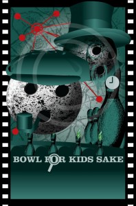
After getting the original flash of inspiration (“Hey, why not Sherlock Holmes?”), I decide on a general design. Certain things have to be there. At least one bowling ball and at least one pin.Then I have to figure out, okay, what’s it going to look like? In this case, I wanted to stylistically emulate the visual style of the recent Sherlock Holmes movies, but not ape them too completely. In both the recent Guy Ritchie movies and the Steven Moffat Sherlock series, they’ve chosen to eschew the classic deerstalker hat; however, it’s such an iconic part of the Sherlock Holmes mythos that without it, the poster wouldn’t scream “Sherlock Holmes”, and in stuff like this, I have to render pieces down to the most easily identifiable shorthand to get the point across. And the pipe… to include it or not? It’s such an iconic part of the Holmes image as well, that to not put it in would leave it feel like it’s missing something… although certainly BBBS agencies might have issues with a smoking device on their posters. Whatever… I decided that for display purposes I’d include it and it could be taken out later if necessary.Then, I figure out what to compliment Holmes with. I could have gone with Watson, but instead I decided to introduce some villainous tension with Moriarty. I didn’t base this one on a particular rendition, but rather decided what would make him look dastardly? Certainly having a prominent top hat with a goatee and monacle would give him that upper crust look, and having part of his face hidden by his lapels would complete the image. I just roughed together the hat at this point.The scenery. What to do about it? Since it’s London, a bowling version of Big Ben had to be there… and since the research I did showed it attached to Westminster Palace with Westminster Bridge crossing the River Thames in front, I rendered all that down to “bowling world language”, re-using the roughed up pin originally used in the pirate poster. Again, re-using the flames created for the “Mummy Adventure” poster created previously, I gave the bridge some life and potential lighting contrast.The background. Used in the second Sherlock Holmes movie, and in countless other crime movies is “the crime map”. Finding a map of modern London, I processed it in Photoshop and Illustrator to render out pretty much all the details. There are bound to be some anachronisms in the map, but it’s pretty much there for texture.
-
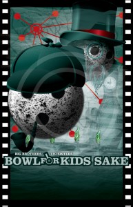
Still in Illustrator, just about everything gets a makeover. The deerstalker hat was pulled together from several different ones I found online. The same with the pipe and Moriarty’s hat. A happy accident came about when researching top hats — I wanted to find a source that matched the angle of the head, and the one I found had this fantastic red ribbon on it. I realized then that the red ribbon would help tie the villainous Moriarty to the red dots and lines on the crime map; sometimes intentional design comes out of happy accidents. I then started rearranging the crime dots a bit; at first they were just thrown down randomly, but then I started placing them in proximity to the other characters, including one quite specifically along Moriarty’s eyeline.It just tied it all together. Some closer research on Big Ben let me detail out the clock face a bit, though I made no attempt to mimic it completely.
It was time to attack the bridge and the water. Again, researching water textures, I started playing with getting the feel of the choppy, shimmering fluid… and then applying a ton of perspective to it. The water actually comprised of three separate shape layers laid down over a coloured background, with another transparent colour layer applied on top of it.
And then the mist. Recycled from the dragon posters, I probably laid down about thirty semi-transparent gradient blends to start obscuring all the work and details that I’d spent a couple hours laying out. My computer was complaining like you wouldn’t believe (gradient blends are a major RAM hog), but… it was worth it.
-
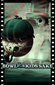
The first two steps were done in Illustrator. Illustrator’s a great layout tool, but for pixel perfect control, you need Photoshop. So, I basically rebuilt the whole thing from scratch, using a JPG output as a base. I brought the entire poster over, pretty much one item at a time, layering them one after another to recreate the original poster, but adding layer effects, grain (grain is so important to achieve that “real look”), and other really innocuous stuff like applying a brick texture to the “bridge”. It’s hard to see when the image is this size, but it’s there, and in the end, all those little pixel variations you introduce really bring the piece to life.
Once everything was reassembled, I took stock of the layout. Adjusted the positioning of Holmes and Moriarty, the clock tower. Added a ton of lighting blurs to make the flames on the bridge look like they really were lighting up the fog. Then, the shadows – on Holmes, on Moriarty and the clock tower… they all add up to really make everything else pop out.
That done, I wanted to capture some of that grainy look of the original movie poster. So, I duplicated the entire piece, flattened it, stripped out the colour, up the contrast and started playing with filters, till I got that heavy grain feel. I then layered that back down over top everything else, played with layering options to get that look… and then overlaid Hue/Saturation and Color Balance adjustment layers that gave me that fine control over the colour, letting me get away from just the straight green it had been and introduce that slightly more uneasy yellow-tinged green.
Finally, I applied some nice bevelling to the title and its backdrop, added some grunginess and grain to it and some shadow, and voila. C’est ça.
Here’re a few more pieces as they developed.
