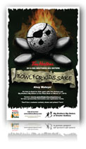
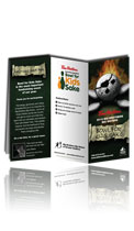
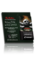
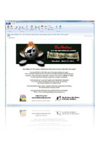
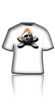
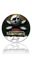
Creating the “skull and crossbones” illustration and the initial poster was just the beginning. It would go on to be applied to a lot of other pieces.
This year’s Bowl For Kids Sake got pretty fun, and expansive in its requirements. I started out just designing the poster, but then the agency’s contact at Tim Hortons liked it so much that they got the go-ahead to replace the typical shoe-leather in-store display materials with this year’s bowling-ball/skull&crossbones theme.
That necessitated the creation of a larger 22×30 poster (the original was 11×17), the backer board and rack cards, and the pledge sheet – inside and out. In addition, as of this writing, I have also created a front and back design for this year’s t-shirts using this year’s artwork, an emailer and those little round support tags you buy for a buck or two and write your name on to post on a wall.
For a step-by-step on the development of the “skull and crossbones” design, click here.
For a view of the expanded set of themes, click here.
